Nutric Packaging Design
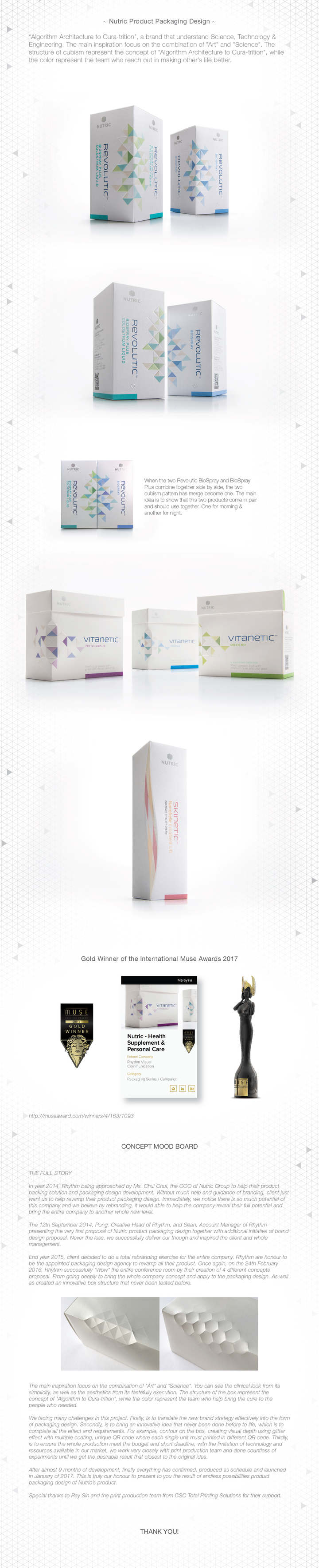
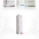
~ Nutric Product Packaging Design ~ Concept “Algorithm Architecture to Cura-trition”, a brand that understand Science, Technology & Engineering. The main inspiration focus on the combination of "Art" and "Science". The structure of cubism represent the concept of "Algorithm Architecture to Cura-trition", while the color represent the team who reach out in making other’s life better. When the two Revolutic BioSpray and BioSpray Plus combine together side by side, the two cubism pattern has merge become one. The main idea is to show that this two products come in pair and should use together. One for morning & another for night. Product Background This is a range of supplement & personal care products that help improve people’s health and appearance. The brief was to redesign the entire Nutric’s packaging and it structure to meet the new brand strategy which is “National Symbol of Uncompromising Science of Nutrition in the World”. MATERIAL & EFFECT FSC Pearlized Card, Triangle Contour, Silver & Clear Hot Stamping, Pearl Varnish, Emboss, Unique QR. CHALLENGES - Translate the new brand strategy effectively into the form of packaging design. - Bring an innovative idea that never been done before to life. Which is to complete all the effect and requirements. For example, contour on the box, creating visual depth using glitter effect with multiple coating, unique QR code where each single unit must printed in different QR code. - To ensure the whole production meet the budget and short deadline, with the limitation of technology and resources available in our market, we work very closely with print production team and done countless of experiments until we get the desirable result that closest to the original idea. GOLD WINNER OF THE INTERNATIONAL MUSE AWARDS 2017 We have been honored with the International Muse Awards following our exceptional Achievements in the industry. THE FULL STORY In year 2014, Rhythm being approached by Ms. Chui Chui, the COO of Nutric Group to help their product packing solution and packaging design development. Without much help and guidance of branding, client just want us to help revamp their product packaging design. Immediately, we notice there is so much potential of this company and we believe by rebranding, it would able to help the company reveal their full potential and bring the entire company to another whole new level. The 12th September 2014, Pong, Creative Head of Rhythm, and Sean, Account Manager of Rhythm presenting the very first proposal of Nutric product packaging design together with additional initiative of brand design proposal. Never the less, we successfully deliver our though and inspired the client and whole management. End year 2015, client decided to do a total rebranding exercise for the entire company. Rhythm are honour to be the appointed packaging design agency to revamp all their product. Once again, on the 24th February 2016, Rhythm successfully “Wow” the entire conference room by their creation of 4 different concepts proposal. From going deeply to bring the whole company concept and apply to the packaging design. As well as created an innovative box structure that never been tested before (show sample mockup for the first presentation). The main inspiration focus on the combination of "Art" and "Science". You can see the clinical look from its simplicity, as well as the aesthetics from its tastefully execution. The structure of the box represent the concept of "Algorithm to Cura-trition", while the color represent the team who help bring the cure to the people who needed. We facing many challenges in this project. Firstly, is to translate the new brand strategy effectively into the form of packaging design. Secondly, is to bring an innovative idea that never been done before to life, which is to complete all the effect and requirements. For example, contour on the box, creating visual depth using multiple coating, unique QR code where each single unit must printed in different QR code. Thirdly, is to ensure the whole production meet the budget and short deadline, with the limitation of technology and resources available in our market, we work very closely with print production team and done countless of experiments until we get the desirable result that closest to the original idea. After almost 9 months of development, finally everything has confirmed, produced as schedule and launched in January of 2017. This is truly our honour to present to you the result of endless possibilities product packaging design of Nutric’s product. Special thanks to Ray Sin and the print production team from CSC Total Printing Solutions for their support.