
I am currently building a design system for my own product work. It has already changed considerably from what I first imagined.
My original plan was to create a small library of reusable components. Once I started applying them to real screens, I realised that the components were only the visible part of the work. I also needed to decide what should remain consistent when they were used in different contexts.
This led me back to the foundations.
Previously, I might adjust the spacing on a screen until the layout felt balanced. That approach becomes difficult to manage across a larger product because it creates many slightly different values. I have started using a defined spacing scale, although I am still testing how much flexibility it needs.
Colour raised a different issue. A name such as “blue-500” describes what a colour looks like, but it does not explain where it belongs. Naming a token “action-primary” connects the colour to its purpose. If the visual direction changes later, the role of that token can remain the same.
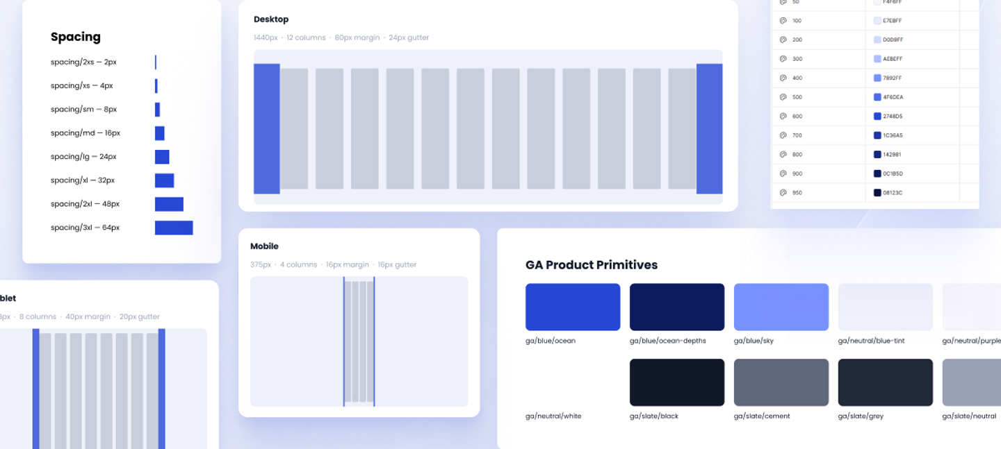
Image1: Exploring how spacing and colour tokens behave across desktop and mobile layouts. The aim is to make each value intentional rather than adjusting it separately for every screen.
---
Typography has required more attention than I expected. Font size alone does not create a reliable hierarchy. I have had to consider how weight and line height affect the way text behaves inside components, especially when the content changes.
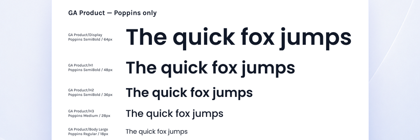
Image2:Testing the type scale with real text helped me see whether the hierarchy remained clear outside the original component files.
---
Working through these foundations has also changed how I think about components. I used to see them mainly as reusable interface elements. Now, I pay more attention to the decisions carried by each component and whether those decisions remain clear when the component is reused.
A new component will sometimes resist the system I have already created. When that happens, I look at the reason before adding an exception. The component may have a requirement that the system does not yet support. It may also show that one of my earlier rules was too restrictive.
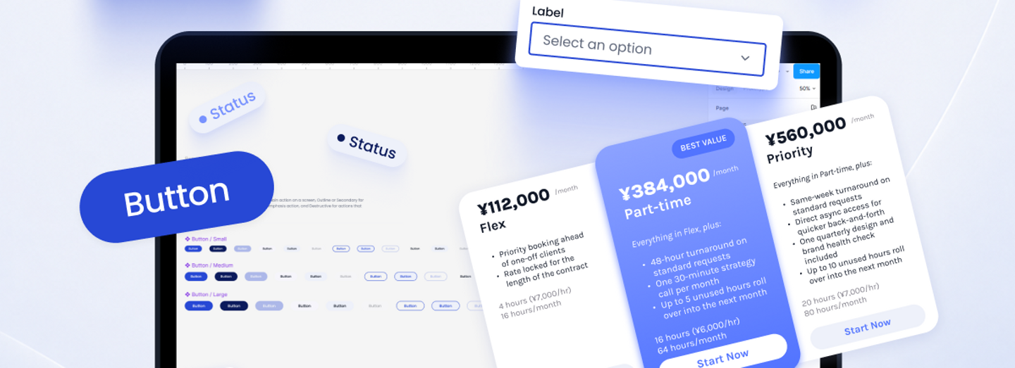
Image 3: Applying the foundations to working components. This is where inconsistencies become easier to notice and the system begins to prove whether it is genuinely reusable.
AI has been useful while I work through these questions. I often use it to examine a naming choice or compare two possible structures. It can also help me notice cases I have overlooked. I still make the final decision because the right answer depends on the product and the context in which the system will be used.
I originally expected to build the system before applying it to my work. In practice, I only find out whether a pattern is useful when I apply it to a realistic screen. That is usually where missing decisions and overly rigid rules become visible.
The system is still evolving, which feels appropriate at this stage. I am less interested in making the library appear complete than in making it dependable over time. I will continue sharing what I learn as I use it in more complex product work.
これからも、どうぞよろしくお願いします。