
𝗛𝗮𝘄𝗸𝗲𝗿'𝘀 𝗰𝘂𝗿𝗿𝗲𝗻𝘁 𝗰𝗼𝗻𝘃𝗲𝗿𝘀𝗶𝗼𝗻 𝗿𝗮𝘁𝗲 𝗶𝘀 𝟬.𝟰%. 𝗧𝗵𝗲 𝘁𝗮𝗿𝗴𝗲𝘁 𝗶𝘀 𝟭%.
Getting from 0.4% to 1% is a significant increase, so I did not begin by simply redesigning the existing pages.
𝗜 𝘀𝘁𝗮𝗿𝘁𝗲𝗱 𝘄𝗶𝘁𝗵 𝗮 𝗿𝗲𝘃𝗶𝗲𝘄 𝗼𝗳 𝘁𝗵𝗲 𝗰𝘂𝘀𝘁𝗼𝗺𝗲𝗿 𝗷𝗼𝘂𝗿𝗻𝗲𝘆.
I looked at the experience from the homepage and product discovery through to the cart and checkout.
The main question was: 𝗪𝗵𝗲𝗿𝗲 𝗶𝘀 𝘁𝗵𝗲 𝗰𝘂𝗿𝗿𝗲𝗻𝘁 𝗲𝘅𝗽𝗲𝗿𝗶𝗲𝗻𝗰𝗲 𝗺𝗮𝗸𝗶𝗻𝗴 𝗶𝘁 𝗵𝗮𝗿𝗱𝗲𝗿 𝘁𝗵𝗮𝗻 𝗻𝗲𝗰𝗲𝘀𝘀𝗮𝗿𝘆 𝗳𝗼𝗿 𝘂𝘀𝗲𝗿𝘀 𝘁𝗼 𝗰𝗼𝗻𝘁𝗶𝗻𝘂𝗲 𝘁𝗼𝘄𝗮𝗿𝗱𝘀 𝗮 𝗽𝘂𝗿𝗰𝗵𝗮𝘀𝗲?
The initial audit is now complete and a number of opportunities came out of the review, including:
• Multiple popups appearing around the same time when users first arrive
• A homepage hero carrying too many messages and competing priorities
• A cart experience with limited support for users who are still deciding
• Opportunities to reduce friction before checkout
• Opportunities to improve abandoned-cart recovery
One of the practical considerations was Shopify's hosted checkout.
Some parts of the checkout experience are difficult to change directly. In those cases, I focused on what could be improved earlier in the journey rather than trying to redesign around platform limitations.
𝗧𝗵𝗲 𝗳𝗶𝗿𝘀𝘁 𝗱𝗲𝘀𝗶𝗴𝗻 𝗰𝗼𝗻𝗰𝗲𝗽𝘁𝘀 𝗰𝗮𝗺𝗲 𝗼𝘂𝘁 𝗼𝗳 𝘁𝗵𝗮𝘁 𝗿𝗲𝘃𝗶𝗲𝘄.
For example, the current thinking around the 10% discount signup is to move the opportunity to the cart.
The cart is a point where the customer has already shown purchase intent, while still giving Hawker more control over the experience than inside the hosted checkout.
The initial concepts also explore:
• Reducing competing messages when users first enter the site
• Simplifying the homepage journey
• Giving the cart a more useful role in supporting purchase decisions
• Moving email capture to a more appropriate stage of the funnel
• Supporting users who leave before completing their purchase
𝗧𝗵𝗲 𝗨𝗫 𝗮𝘂𝗱𝗶𝘁 𝗮𝗻𝗱 𝗶𝗻𝗶𝘁𝗶𝗮𝗹 𝗰𝗼𝗻𝗰𝗲𝗽𝘁 𝘄𝗼𝗿𝗸 𝗮𝗿𝗲 𝗻𝗼𝘄 𝗰𝗼𝗺𝗽𝗹𝗲𝘁𝗲 and I'𝗺 𝗰𝘂𝗿𝗿𝗲𝗻𝘁𝗹𝘆 𝗺𝗼𝘃𝗶𝗻𝗴 𝗶𝗻𝘁𝗼 𝘁𝗵𝗲 𝗳𝗶𝗻𝗮𝗹 𝗱𝗲𝘀𝗶𝗴𝗻 𝗽𝗵𝗮𝘀𝗲.
This is where I am taking the initial concepts and developing the final high-fidelity designs.
That includes applying the Hawker brand more fully, refining the UI, working through the details of the interactions, and making sure the individual screens work together as one customer journey.
The work is still in progress, so the visuals I am sharing are not presented as the final answer. They show the project at the point between: 𝗨𝗫 𝗮𝘂𝗱𝗶𝘁 → 𝗶𝗻𝗶𝘁𝗶𝗮𝗹 𝗰𝗼𝗻𝗰𝗲𝗽𝘁𝘀 → 𝗳𝗶𝗻𝗮𝗹 𝗵𝗶𝗴𝗵-𝗳𝗶𝗱𝗲𝗹𝗶𝘁𝘆 𝗱𝗲𝘀𝗶𝗴𝗻
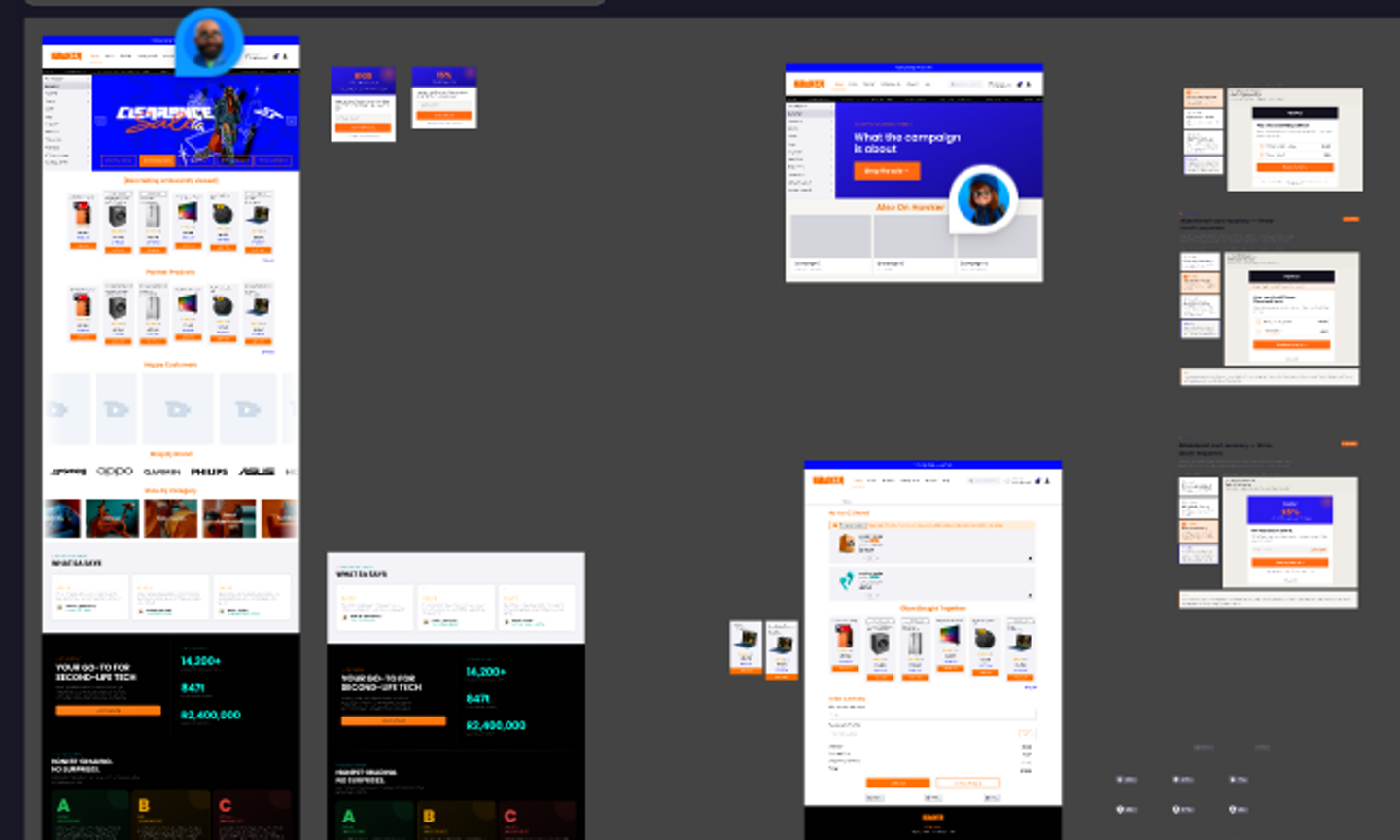
The audit work is complete.
The design approach has been established and n𝗼𝘄 𝗜 𝗮𝗺 𝗯𝘂𝗶𝗹𝗱𝗶𝗻𝗴 𝘁𝗵𝗲 𝗳𝗶𝗻𝗮𝗹 𝗱𝗲𝘀𝗶𝗴𝗻𝘀.
I will share more of the process as the project develops if there is enough interest :)
For those interested, the initial conversion audit can be viewed here:
Hawker Conversion Audit